I am a big fan of Vuetify - it has far too many components available out of the box and makes my life as easy as it gets. But that does not prevent me from getting annoyed by small “stuff” that matter.
Take tooltip as an example. Vuetify has v-tooltip component to enable tooltips -
<template>
  <div class="text-center d-flex align-center">
    <v-tooltip bottom>
      <template v-slot:activator="{ on, attrs }">
        <v-btn color="primary" dark v-bind="attrs" v-on="on">Button</v-btn>
      </template>
      <span>Yes, this is a button</span>
    </v-tooltip>
  </div>
</template>
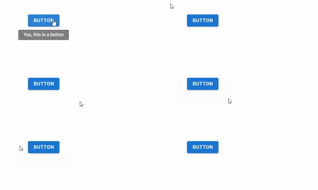
This will result in the below UI -

But, 6 lines of code for every tooltip is just ridiculous. In an ideal world, I would want something like -
<v-btn color="primary" dark tooltip="Yes, this is a button">Button</v-btn>
Since we don’t quite live in an ideal world yet, we can solve this problem on our own. I typically end up using one of the two solutions outlined below.
Solution 1: Use v-tooltip
v-tooltip is a super easy-to-use tooltip solution that is used by the entire Vue universe.
Install the library -
npm i --save v-tooltip
Add plugin to Vue -
import Vue from "vue";
import VTooltip from "v-tooltip";

Vue.use(VTooltip);
Use the tooltip -
<v-button v-tooltip="'Yes, this is a button'"></v-button>
It may also be a good idea to include the default tooltip styles - just in case.
While this is a good, easy-to-use solution - I don’t really see myself using much. v-tooltip has a dependency on loadash and popper.js, which makes it a heavy-enough solution for general usage if I am not using the said libraries for other purposes.
Solution 2: Create your own tooltip component
Be pragmatic now - how many components will you include tooltip on?
- Images
- Description for hard-to-understand buttons
- List
- ??
Instead of using third-party libraries, I just do the below nowadays -
- Include the full Vuetify tooltip in components like lists (which are hopefully small, anyway)
- Create a reusable component for button, image cards etc. that wraps over tooltip
(1) is fairly standard. Here’s what you do for (2) - create your own component for a button.
Create a new component ButtonTip -
<template>
  <v-tooltip bottom>
    <template v-slot:activator="{ on, attrs }">
      <v-btn :color="color" v-bind="attrs" v-on="on" @click="raiseClickEvent()">
        <v-icon :color="iconcolor"> {{ icon }} </v-icon>
        {{ text }}
      </v-btn>
    </template>
    <span> {{ tooltip }} </span>
  </v-tooltip>
</template>

<script>
  export default {
    name: "ButtonTip",
    props: {
      text: { type: String, required: false, default: "" },
      icon: { type: String, required: false, default: "" },
      color: { type: String, required: false, default: "primary" },
      iconcolor: { type: String, required: false, default: "white" },
      tooltip: { type: String, required: false, default: "" },
      eventname: { type: String, required: false, default: "clickyclicky" },
    },
    methods: {
      raiseClickEvent() {
        this.$emit(this.eventname);
      },
    },
  };
</script>
If you want a button that displays tooltip in a component, you can now use -
<ButtonTip
  text="Delete"
  icon="mdi-delete"
  tooltip="Delete"
  eventname="deleterec"
  @deleterec="deleteRecord()"
/>
What we are doing here is quite simple -
- Created a new Vue component that takes a bunch of props
- Reused that component in other pages / components, passed on the props to achieve the desired result (in our case show a button with the relevant text, icon and tooltip)
- When the button is clicked, we want to pass the
click eventback to the parent. That’s the role ofeventnameand@deleterec(there will be shortcuts to do this, which I am sure I have missed)
See the same Codepen to see ButtonTip in action.
End
Ain’t life exciting?