Vuetify is a God-send for lazy developers like me. Thanks to Vuetify I have all styles standardized, customise UI to my heart’s content and create an app that is ready to take on any device.
But, Vuetify does not support masonry layout for your grid. Here’s a look at available options if you need masonry layouts in your projects.
A Typical Vuetify Grid
The typical Vuetify grid is made up of rows and columns. Creating such a grid is quite simple.
<template>
  <v-row>
    <v-col cols="12" md="4"> People </v-col>
    <v-col cols="12" md="4"> are </v-col>
    <v-col cols="12" md="4"> awesome </v-col>
  </v-row>
</template>
The components in a column can be anything. So, let’s include images.
<template>
  <v-row>
    <v-col cols="12" md="4">
      <v-img height="300px" src="https://picsum.photos/seed/1/200/100"></v-img>
    </v-col>
    <v-col cols="12" md="4">
      <v-img height="300px" src="https://picsum.photos/seed/1/200/100"></v-img>
    </v-col>
    <v-col cols="12" md="4">
      <v-img height="300px" src="https://picsum.photos/seed/1/200/100"></v-img>
    </v-col>
  </v-row>
</template>
Making some small changes here and there, we get this.
Here’s the Codepen demonstrating a standard Vuetify grid.
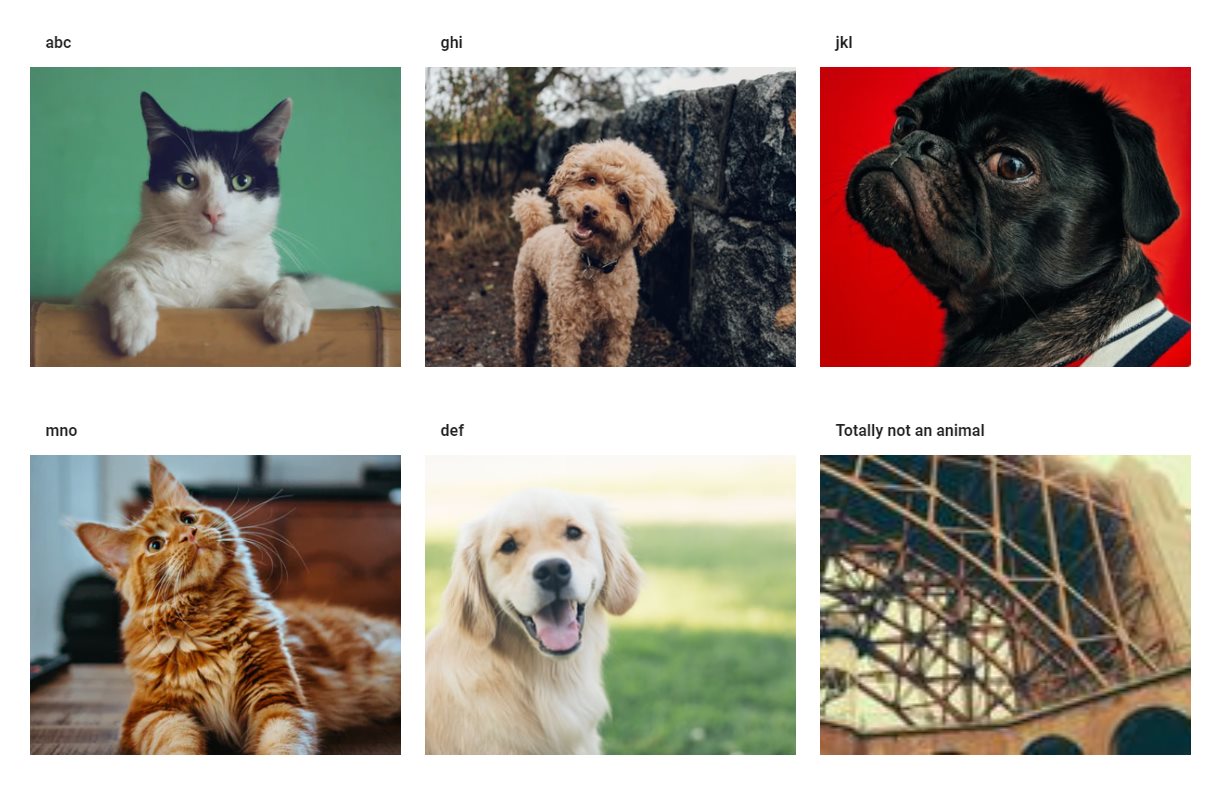
The grid is awesome and UI is responsive. Each column occupies 1/3rd the available screen space for large screens but expands to 100% of the screen in small view ports.
This is all good, until you meet images like you have in the above image. Each image can have its own height and may straight-up look uncool if you start restricting the height of images.
So, let’s remove images from the artificial shackles of fixed height.
<!--  ... -->
<v-img :src="item.img"></v-img>
<!--  ... -->
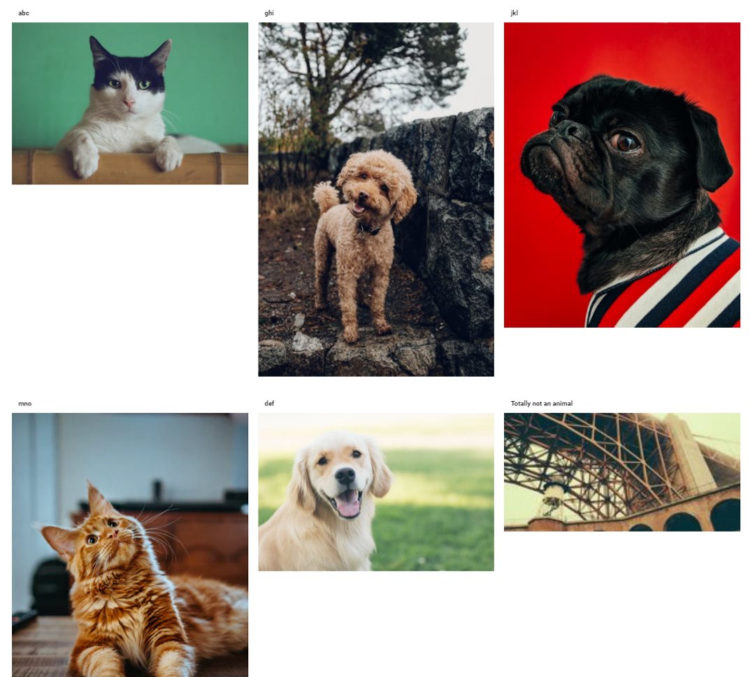
The varying image heights does not show the full power of this grid and can have insane side-effects on otherwise sane people. You could alleviate the problem somewhat by using height=100% against the card and make all cards with uniform height, but the result is not a lot different in the above example.
The row height is equal to the height of the tallest image and you cross-over to the dark-side of using white space where it isn’t required.
What is masonry layout?
Masonry layout enables a combination of fixed width and full height for the components of a grid.
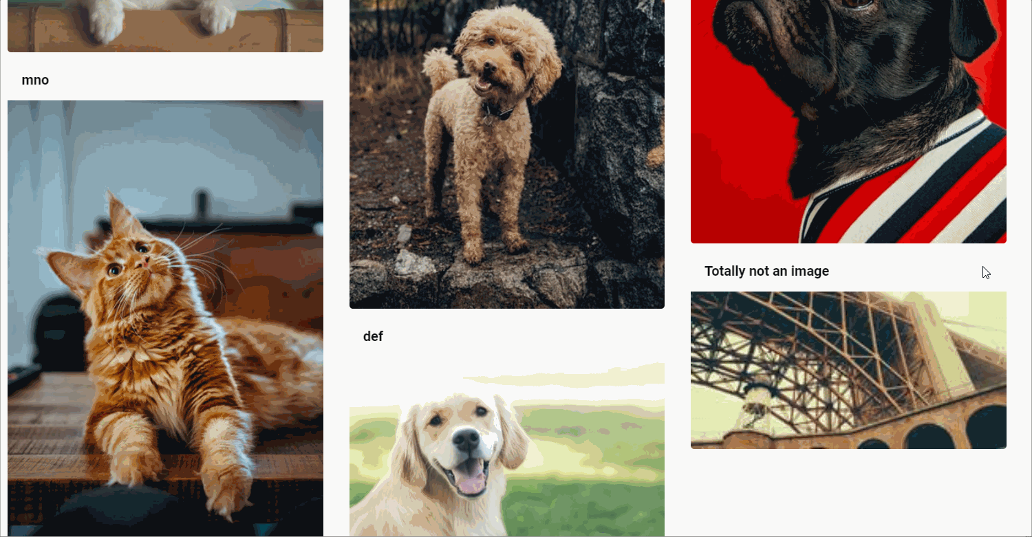
As compared to a standard Vuetify grid, this offers full height when retaining the width. This is useful especially while displaying images/videos, but can have other use cases too.
Unfortunately there are no standard ways for varying row heights to build a masonry layout in Vuetify. But, there are a couple of ways to enable such layouts using additional libraries.
Creating masonry layout in Vuetify
Use v-masonry
v-masonry provides an easy way to add masonry layout to any Vue project. The library provides a Vue-specific wrapper around masonry package.
Start by installing v-masonry.
npm install vue-masonry --save
Include v-masonry reference in main.js.
import Vue from "vue";
import App from "./App.vue";

import Vuetify from "vuetify";
import "vuetify/dist/vuetify.min.css";
import "@mdi/font/css/materialdesignicons.css";
import { VueMasonryPlugin } from "vue-masonry";

Vue.config.productionTip = false;

Vue.use(Vuetify);
Vue.use(VueMasonryPlugin);

new Vue({
  render: (h) => h(App),
}).$mount("#app");
Next, change the component to include v-masonry.
<v-container>
  <v-row v-masonry>
    <v-col v-for="(item, index) in items" :key="index" cols="12" sm="4">
      <v-card height="100%" color="blue" class="pt-1 pb-1">
        <v-card-title>{{item.title}}</v-card-title>
        <v-img :src="item.img" @load="this.$redrawVueMasonry()"></v-img>
        <v-card-text>{{item.text}}</v-card-text>
      </v-card>
    </v-col>
  </v-row>
</v-container>
Note that we must call this.$redrawVueMasonry() to repaint the layout after the images are loaded since v-img is lazy loading.
I really liked v-masonry. I can happily use any tags anywhere, and just include a v-masonry to perform all the magic.
Here’s a Codesandbox example.
Use vue-masonry-css
Another easy way to create masonry layout is by using vue-masonry-css. It’s based on the same underlying masonry library - so don’t expect anything to drastically change.
To start with vue-masonry-css, add the library to your project.
npm i --save vue-masonry-css
Change your component to use the new layout.
<template>
  <v-container>
    <masonry
      :gutter="{ default: '30px', 700: '15px' }"
      :cols="{ default: 3, 1000: 3, 700: 2, 500: 1 }"
    >
      <v-card
        v-for="item in items"
        :key="item.id"
        class="mt-2 mb-2"
        color="blue lighten-3"
      >
        <v-toolbar flat dense color="transparent" class="font-weight-bold">
          {{item.title}}
        </v-toolbar>
        <v-img :src="item.img"></v-img>
      </v-card>
    </masonry>
  </v-container>
</template>
The big advantage of using vue-masonry-css is the “automatic refresh” of layout after the images/ cards are resized. Depending on your use case, you may or may not like the distinct <masonry></masonry> tag.
Here’s a Codepen that demonstrates using Vuetify + vue-masonry-css -
https://codepen.io/techformist/full/ZEWyJOq.
The End
While masonry layout itself can be quite easily achieved regardless of your style library of choice, there were persistent issues with how cards can be resized in the layout when using Vuetify. I would have been delighted if Vuetify offered something like this out-of-the-box. Vote for the idea if you are in the same camp.