Centralize all error, warning and info alerts in one place.
I like v-alert and tend to over-use it. It enables us to show detailed notifications (error or otherwise) - without significantly causing user inconvenience. I find v-alert more suitable in my apps than using, say, popup alerts that interrupt users, or “toast” notifications which I find unsuitable for detailed messages.
I use v-alerts to -
- display error or informational messages post an API call
- show form validation errors that cannot be shown against individual controls
- guide user action
How do I alert?
Using alert in Vuetify is simple enough. Introduce this one line in your components that needs alerts.
<v-alert :type="dispType" :value="dispMsg" dismissible>{{dispMessage}}</v-alert>
Where should I place v-alert?
Initially I used to introduce v-alert in views or components on a need basis. This resulted in non-standard positions and confuse users in any application with more than 2 screens.
Almost immediately after my initial learning (/failing) phase, I switched to using v-alert in views and used different messages in distinct views.
<!-- Contact.vue -->
<v-alert :type="error" :value="contactError" dismissible
  >{{contactError}}</v-alert
>

<!-- Task.vue -->
<v-alert :type="error" :value="taskError" dismissible>{{taskError}}</v-alert>
This works really well especially if your users are changing screens frequently and tend to pick up work where they left off moments ago. Users can maintain context to the previous errors since the error messages are different from each other.
However, I find this rather boring to maintain. Any changes to alert will need changes in multiple places.
The next step and the natural evolution - put the alert in a different component (Alert.vue) and use that component everywhere.
<!-- Alert.vue -->
<template>
  <div>
    <v-alert class="text-center" :value="!!message" :type="type" dismissible
      >{{ alert['message'] }}</v-alert
    >
  </div>
</template>
Include this component using a simple statement in any component that needs to call alert -
<Alert :message="dispMessage" :type="dispType"></Alert>
We can either use prop as demonstrated above or use Vuex.
You know where I am going with this - it gets tedious as well. Include a one-liner in every view - give me a break.
Ergo, my current favourite design.
The centralized alert management system
Don’t get scared by the name, it’s rather simple and silly.
First, we create a alert component as before. Here’s a spicy version that works well with Vuetify 2 and has alert managed through Vuex modules-
<!-- Alert.vue -->
<template>
  <div>
    <v-alert
      class="text-center"
      :value="!!alert['message']"
      :type="type"
      dismissible
      outlined
      border="left"
      @input="closeAlert"
      >{{ alert['message'] }}</v-alert
    >
  </div>
</template>

<script>
  import { mapState, mapMutations, mapActions } from "vuex";

  export default {
    computed: {
      ...mapState("pgtalert", ["alert"])
    },

    methods: {
      ...mapMutations("pgtalert", ["setAlert"]),
      closeAlert(val) {
        this.setAlert({});
      }
    }
  };
</script>
pgtalert is a Vuex module and alert is an object that stores alert messages in the module - as you can very well deduce from the code.
We will include this Alert component in a frame (call it Panel.vue). This frame will form the basis for any view in our application.
<!-- Panel.vue -->
<template>
  <div>
    <v-toolbar flat dense>
      <v-toolbar-title class="title primary--text ">
        <v-icon v-if="icon" color="primary" class="mr-2">{{ icon }}</v-icon>
        <span color="primary">{{ title }}</span>
      </v-toolbar-title>
      <v-spacer></v-spacer>

      <slot name="toolbar-items"></slot>
    </v-toolbar>
    <Alert />
    <v-row>
      <v-col cols="12">
        <slot name="content">No content</slot>
      </v-col>
    </v-row>
  </div>
</template>

<script>
  import { mapState } from "vuex";
  export default {
    name: "panel",

    components: {
      Alert: () => import("./layouts/Alert")
    }
  };
</script>
We use Panel in our views.
<!-- Task.vue -->
<template>
  <Panel title="Tasks">
    <template slot="content">
      <TaskList></TaskList>
    </template>
  </Panel>
</template>
Now, all we have to do is to update pgtalert/alert whenever we want to display an alert.
// ./store/task.js

// lot of code

//some async op - e.g. API call
.then(({data}) => {
    doSomething(data)
})
.catch(e => {
    commit( "pgtalert/setAlert", { message: "Error." + e,
        type: "warning" }, { root: true });
})
// more code
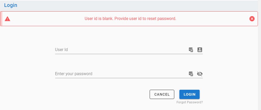
And, ta da..
You could also reset alerts when a subsequent transaction takes place. I find it easier to set it in a central helper function that calls Axios / fetch.
Final note
The approach described above is nothing fancy, but does a couple of good things -
- Centralized alert management - you can change any formatting in one place and you are done
- You don’t need to explicitly introduce this component in all views
It also has some limitations -
- Messages get reset when other transactions trigger alerts
- No ability to customize where messages appear (beyond where the
alertcomponent is placed in parent layout/component)