Date pickers are straight forward to implement, but input fields with date pickers need a bit of decoration.
What we need?
An input field with a date picker that
- opens on click
- shows the selected date
How do we create that?
We start with the ‘date picker’ component in Vuetify.
<template>
  <v-layout row wrap>
    <v-date-picker
      locale="en-in"
      :min="minDate"
      :max="maxDate"
      v-model="fromDateVal"
      no-title
    ></v-date-picker>
  </v-layout>
</template>
<script>
  export default {
    data() {
      return {
        fromDateVal: null,

        minDate: "2019-07-04",
        maxDate: "2019-08-30",
      };
    },
  };
</script>
Bind value to fromDateVal. Specify locale, min & max dates.
Introduce input box
Complement date picker with a text field input.
<template>
  <v-layout row wrap>
    <!-- other code -->
    <v-text-field
      label="From Date"
      readonly
      prepend-icon="event"
      :value="fromDateDisp"
    ></v-text-field>
  </v-layout>
</template>
<script>
  export default {
    data() {
      return {
        fromDateVal: null,

        minDate: "2019-07-04",
        maxDate: "2019-08-30",
      };
    },
    computed: {
      fromDateDisp() {
        return this.fromDateVal;
        // format date, apply validations, etc. Example below.
        // return this.fromDateVal ? this.formatDate(this.fromDateVal) : "";
      },
    },
  };
</script>
We use a distinct value fromDateDisp to display the date picked in the date picker. You can just use the fromDateVal directly as well (depending on where your date is coming from and whether the format is as expected). Else use a computed value to apply validations, do any formatting incl. applying filters.
I often end up using a readonly against the text box so that users always pick dates from the picker.
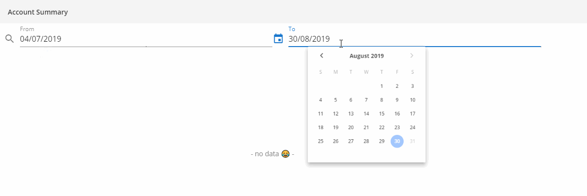
Wrap in menu
Use a menu component to wrap the input box and date picker. Open date picker only when the text box is clicked.
<template>
  <v-layout row wrap>
    <v-menu
      v-model="fromDateMenu"
      :close-on-content-click="false"
      :nudge-right="40"
      lazy
      transition="scale-transition"
      offset-y
      full-width
      max-width="290px"
      min-width="290px"
    >
      <template v-slot:activator="{ on }">
        <v-text-field
          label="From Date"
          prepend-icon="event"
          readonly
          :value="fromDateDisp"
          v-on="on"
        ></v-text-field>
      </template>
      <v-date-picker
        locale="en-in"
        :min="minDate"
        :max="maxDate"
        v-model="fromDateVal"
        no-title
        @input="fromDateMenu = false"
      ></v-date-picker>
    </v-menu>
  </v-layout>
</template>
<script>
  export default {
    data() {
      return {
        fromDateMenu: false,
        fromDateVal: null,

        minDate: "2019-07-04",
        maxDate: "2019-08-30",
      };
    },
    computed: {
      fromDateDisp() {
        return this.fromDateVal;
        // format date, apply validations, etc. Example below.
        // return this.fromDateVal ? this.formatDate(this.fromDateVal) : "";
      },
    },
  };
</script>
And, tada.. your date picker is ready and kicking.
A working example is at https://codepen.io/prashanth1k/pen/eYmoraP.