Navigation can be in form of links in static or drop-down menus in the main header or side-bar. We have to be careful and test navigation experience on all form factors and device types.
I came to web development from the enterprise world. The data-driven applications that are built using off-the-shelf products are not quite cutting edge on adhering to the greatest of web standards.
Consider these CRM application examples -
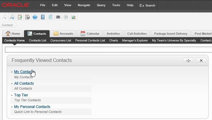
The application has many features exposed to users at once and is geared towards productivity. Now, this is perfectly fine if you have an controlled audience, a good training budget, have a distinct mobile app, and may not require responsiveness to permeate every fabric of your application.
Tough luck if you are not that.
I faced some difficult choices building small-scale applications to a niche audience when I switched gear in my career. My initial data-driven applications tried to emulate the horizontal navigation, drop-down menus, and sub-navbars - but it was not quite well-received in applications far simpler than their off-the-shelf counterparts .
Surprisingly (or otherwise) users in the ’non-enterprisey’ world denounced too many options in menu. They ‘sorta’ liked to click through simpler/cleaner UI, onto a contained entity that exposed functions incrementally.
Wrong developer for the right audience? May be.
Anyhow, I adapted.
Here are the standards that are not quite new to developers in the same space.
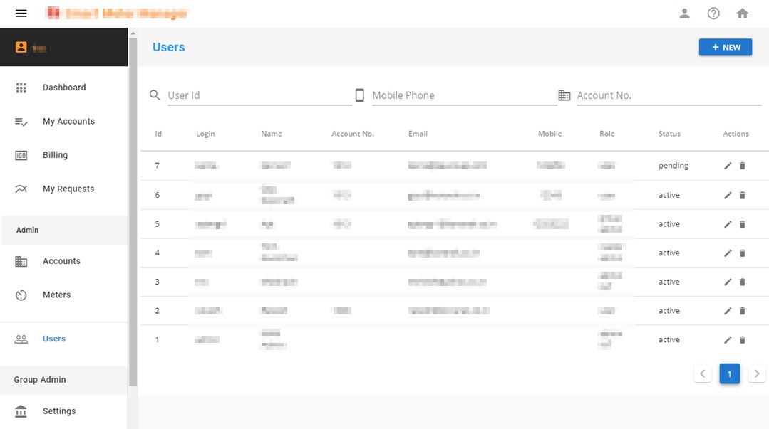
- Include only main navigation links in/around the main toolbar
- Fold main navigation in the hamburger/kebab menu for smaller form factors
- No drop-downs in menu - this causes confusion to mobile users
- Side bar on left. Fold in hamburger menu for smaller form factors. Open left nav menu by default in larger (md+) screens
- Contextual menu (optional) to the right. Include things like contextual help, record-level operations here. This is hidden by default
- Anchor links are limited to the home page (non user). Any navigation has quick animation to maintain context
- Navigation within detail pages (e.g. Edit / New functionality, View details) are through pop-ups. They almost never navigate to the related record pages - maintain context for the parent record at all times
- Also: navigation links in header is never fixed, though side bar(s) is fixed
No prizes for guessing that this is aligned to material design principles. I don’t quite have the money and muscle to develop standards on my own. I could get acceptable feedback from “most” users, and I stuck to either changing stuff minimally or convincing users about how the entire industry is built on these principles. So, I tend to follow these principles for navigation - even when not using material design for the overall application.
I am far from reaching the nirvana-level user experience, but my data-driven apps have somewhat standard structure that is reusable across applications. That is one less decision to be made when churning out the next beautiful app for the world.