I had been searching for modern but clean looking themes for one of my older Blogs. I had been using Sahifa earlier.
Although the theme is good and does its job, Sahifa is not really pleasing to the eye. This is my opinion, of course. The way I see websites and Blogs has changed over time (hopefully for the good), and Sahifa did not fit the definition of a “clean”, “minimal” theme.
As you will be well aware, searching for anything related to Wordpress is a nightmare. One is inundated with free, paid, and partially-paid components with a million reviews highlighting all possible positives about a theme or plugin.
Unfortunately, I don’t qualify as a good designer and cannot design something all by myself. What I do have is an eye for a clean design that invites readers to a long read (preferably with a cup of hot coffee).
So I did the next best thing - I “invested” a good couple of hours in searching for the right theme. That bumped me back to wordpress.com, the not-so-loved cousin of our best friend wordpress.org.
I liked two free themes by Automattic, both of which happen to be completely free.
1. Scrawl
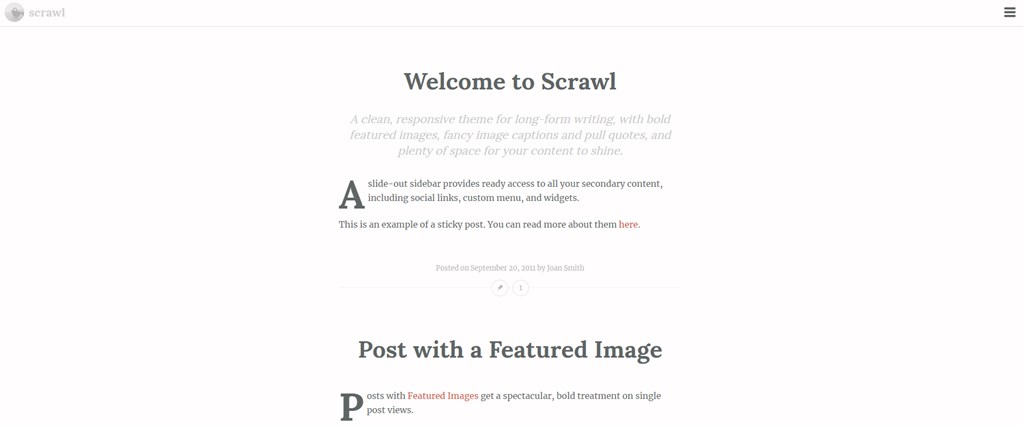
Scrawl is a clean looking, minimal theme that showcases the written word. The theme does not have any noise at the very top - features just a logo (that you have to really look for), and a hamburger button that opens up your set menu.
I was bowled over with the looks of the theme and the typography. It provides a few customization options through Customizer, and I was more than happy with what it could offer.

However, there were a couple of things I was not delighted about -
- Font used in the menu is strangely big as compared with rest of the website (probably that is intended for 2-3 options rather than scale to a page)
- Site title to the far left adds almost no brand value
- Limited customization is also a con
2. Syntax
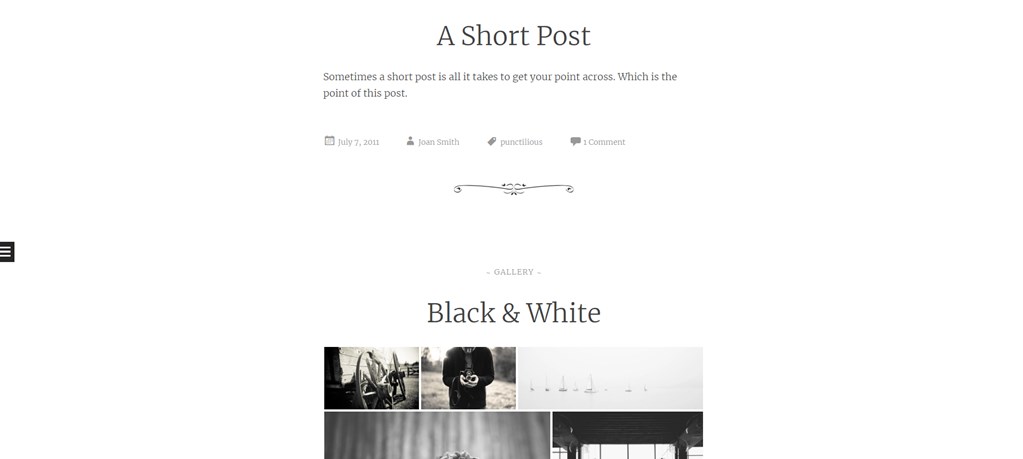
Again, here’s a clean theme that showcases the content really well, beautiful typography, and has no menu bar. I particularly liked the way images blend in with the content, the slightly darker color that is more legible, and the way code is depicted on the page.

However, I was not a fan of -
- the hamburger menu on the middle of the page to the left
- design that marks the completion of a post (this could be removed easily enough)
- categories displayed at the top of the post, while rest of metadata is below the title
- lack of updates
Even though I liked Syntax better, I chose Scrawl for my Blog at this time. Scrawl is more pleasing to a serious reader :), and is more up-to-date (as of Y2018).
The popularity of Wordpress sure brings in a lot of assets, but some of those valuable assets needs some serious digging. And if you are left scratching your head on why use Wordpress in this age of headless everything - that is a post for another day.