Tooltips are omnipresent, or rather have to be. While there have been excellent standardisation of user experience since we saw what Bootstrap was capable of, there are days and applications that can throw off users with strange icons, buttons and navigation. Ergo, tooltips.
The humble tooltip can provide helpful hints, short messages and guide user on what a particular button, text box or any other element will do before clicking the thingy and causing destruction of a planet.
Vue has more than few options for creating tooltips.
Use tooltip from UI library
Every UI library has support for tooltips in some form. Take Vuetify as an example.
<template>
<div class="text-center d-flex align-center">
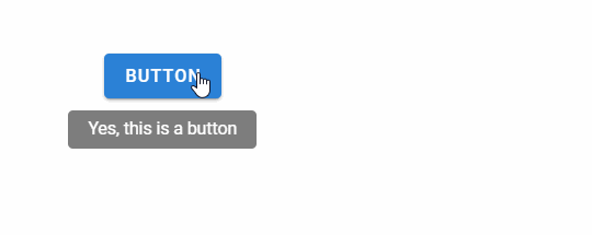
<v-tooltip bottom>
<template v-slot:activator="{ on, attrs }">
<v-btn color="primary" dark v-bind="attrs" v-on="on">Button</v-btn>
</template>
<span>Yes, this is a button</span>
</v-tooltip>
</div>
</template>
Just encapsulate any component with v-tooltip and you are all set.
See how you can create reusable tooltip in Vuetify.
Other libraries are somewhat better - BootstrapVue, Buefy etc. have simple ways to enable tooltips.
I typically prefer to use the tooltip provided by the styling libraries -
- has uniform user experience as compared to rest of the application
- (mostly) has no/minimal overhead since we are downloading other components anyway
But as you can see from the Vuetify example, it is no where near to ideal. Also, you may not use styling libraries for whatever strange reason and we don’t want you to be stuck without tooltips. See those options next.
Tooltip using JS
We are accustomed to someone else doing the hard work in the Javascript world. For Vue that happens to be @akryum from the Vue core team.
To get started, install v-tooltip.
npm install --save v-tooltip
Refer the package in the main.js file in your Vue project.
import VTooltip from "v-tooltip";

Vue.use(VTooltip);
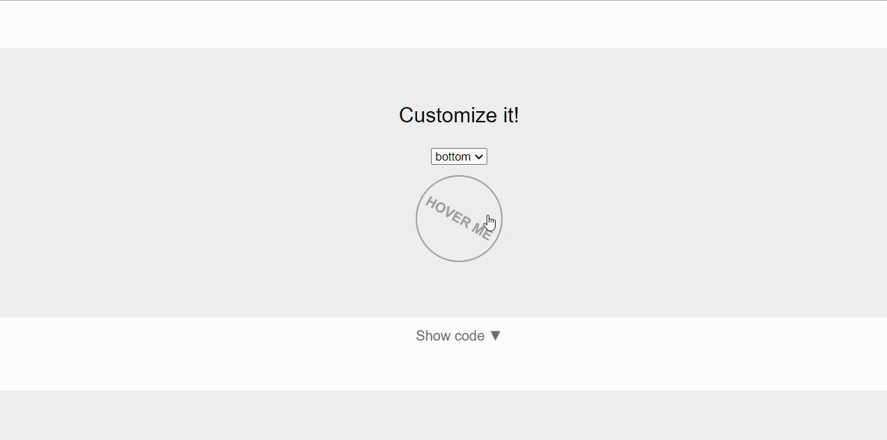
.. and start using the tooltip.
<button
  v-tooltip="{
  content: msg,
  placement: placement,
}"
>
  Hover me
</button>
This way of enabling tooltip in Vue projects is really simple. But, the javascript code (v-tooltip uses popper.js), (minimal) CSS and any other components add up to the long list of components to be downloaded by the browser.
Bundlephobia reports v-tooltip as being 64.7kB minified and 19.9kB gzipped. Not ideal at all. Other options like tooltip.js, tippy.js etc. do exist, but none of they clock ~8-13 kB upwards minified+gzipped.
Simple CSS for Tooltips
Tooltips can be created for any component using pure CSS. While this option may not be super powerful but more than makes up for that with it’s lightweight nature.
There are multiple options to enable tooltip using CSS - balloon-css, hint.css and microtip are popular options. All these clock ~1KB minified+gzipped.
For example, this is what we need to do to use microtip.
Add the CSS reference in index.html in your Vue project.
<link rel="stylesheet" href="https://unpkg.com/microtip/microtip.css" />
Start using the tooltip.
<button
  aria-label="This is a cool tooltip"
  data-microtip-position="bottom"
  role="tooltip"
/>
You could also install microtip as a package and reference that in the project.
Tooltip using CSS is simple and effective!
Finis
Using tooltips based on CSS is super useful, and is my preferred option (whenever UI libraries fall flat that is). But, I totally understand popular libraries like v-tooltip have their place and am cool with that too :)